Steelpoort Town

STEELPOORT TOWN

BRIEF

With Steelpoort Town undergoing a revival, LIVECOM was asked to refresh their website to echo the growth and development that was taking place. We also looked at the town’s image and wanted to create a brand that reflected both the story of the history of the town and the vibrant future and rejuvenation the town was going through.

SOLVE

As a favoured stop on the way to their holiday destinations for many South Africans, the Steelpoort Town website had to highlight the growth of the town, tantalise visitors to stop and spend some time there and also act as an information hub about the surrounding holiday attractions.

Through beautiful photography, art directed by LIVECOM, and easy to find information, visitors to the area will find that the Steelpoort website echoes the memorable experience of visiting the town itself.

To view the website, visit: steelpoorttown.co.za

RESULTS

Social Marketing Trends and the impact on Business

ISUZU Drivetrain Website

ISUZU DRIVETRAIN WEBSITE

BRIEF

The cost implications of downtime can be substantial and have a great impact on your business when your truck’s drivetrain fails, not knowing who to contact when this happens is an even bigger problem.

LIVECOM was asked to create a website for one of ISUZU South Africa’s sub-brands, ISUZU Drivetrain.


SOLVE

The LIVECOM team shifted into first gear and approached the website with ‘responsiveness’ in mind. The one page layout was designed for easy use on desktops and mobile. To add to the website and make the website content visually pleasing we designed icons for the signs of a failing drivetrain, with a call to action to contact ISUZU Drivetrain when your drivetrain shows any of these signs.

Check out the website at isuzudrivetrain.co.za

RESULTS

Nestlé NIDO Social & Digital Guides

NESTLÉ NIDO SOCIAL & DIGITAL GUIDES

BRIEF

Nestlé NIDO Switzerland approached the LIVECOM team to create digital assets for their newly launched division – NutriTods. This division positions NIDO as the Experts in Toddlerhood and will be rolled out globally, to all agencies and stakeholders.

SOLVE

The NIDO brand has been loved and trusted for many years by moms all around the world. To introduce the new NutriTods division to the world, an “Evergreen” set of digital assets needed to be created to establish the importance of toddlerhood and the role of NIDO through engaging and visually exciting content.

These assets had to be adaptable to global markets, with the ability to be tailored to all digital platforms, and includes video’s, social media posts and infographics. The content blends lifestyle imagery and footage, with a childlike take on the world, through custom illustrations, bright colours and a relatable tone of voice.

Along with the assets, a usage guide for each asset was created, as well as a usage guide for all elements associated with the NutriTods division.

RESULTS

2nd Life Packaging

2nd LIFE PACKAGING

BRIEF

Proactively, the LIVECOM team wanted to look at packaging in a different way – a way that it would make a difference to both our lives and the environment.

SOLVE

So, we decided to have a look at how packaging could live again & be reused & reused. Our ideas stemmed from what consumers normally use packaging again i.e. paint pallet ice-cream tubs – we all know mom uses these for art supplies all the time. And this is where the “2nd life packaging” concept where born.

RESULTS

In total we reached 378 568 potential property buyers that could simply view the developments on offer.

The Codfather website

THE CODFATHER WEBSITE

BRIEF

The Codfather seafood restaurant asked LIVECOM to develop their new customer facing website.

SOLVE

We all know that eating out actually begins when you’re deciding where to go. We designed and developed a taste bud tingling reflection of exactly what The Codfather has to offer patrons, packed with appetite appeal. The site is full of beautifully shot food photography, art directed by LIVECOM, showcasing the restaurant’s menu variety, whilst still keeping within their brand look and feel. Bon Appétit!


To view the website visit: thecodfather.co.za

RESULTS

Rona Group

RONA GROUP

BRIEF

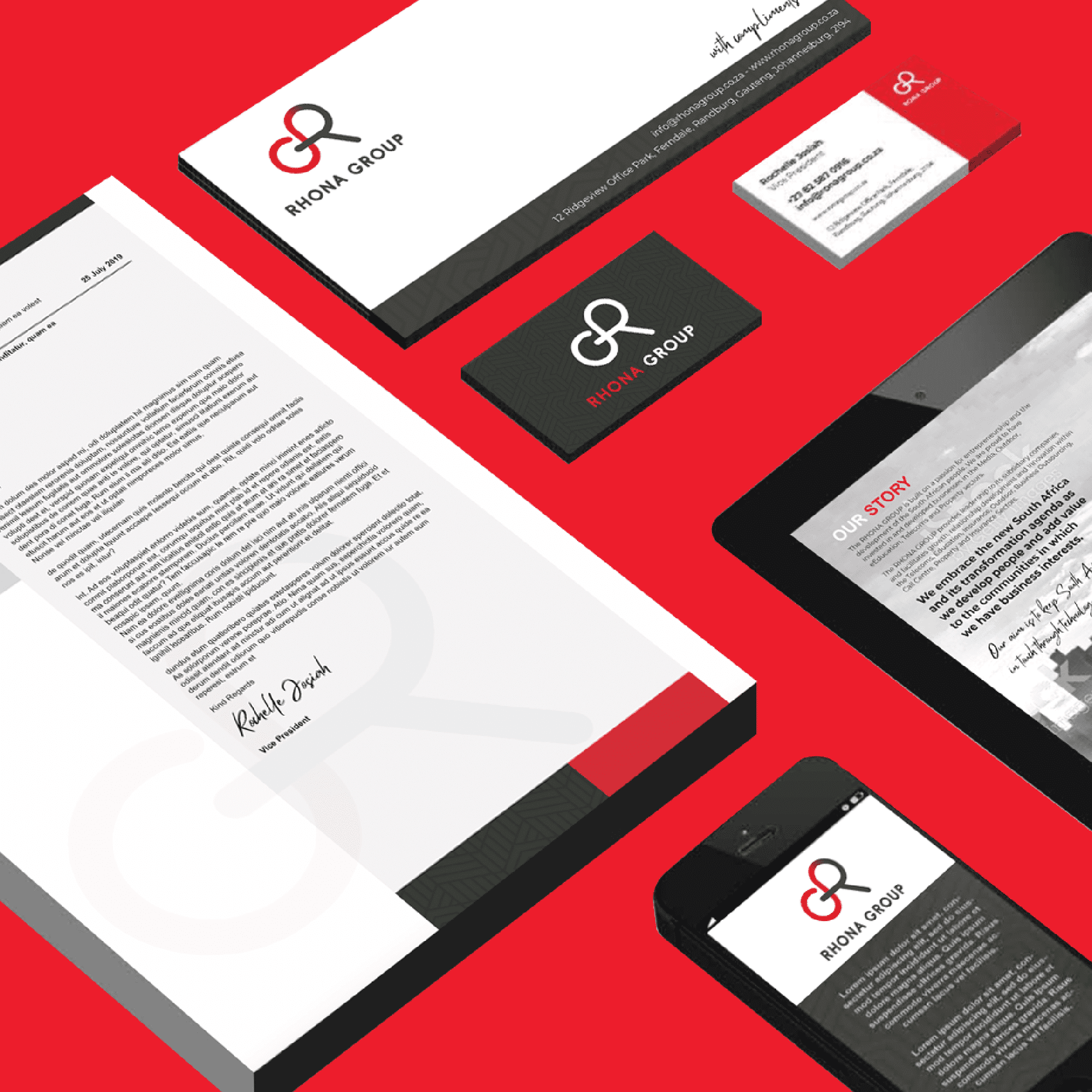
Originally known as Talis Group, Rona Group approached LIVECOM to assist them in transforming their company into the now know Rona Group with a strong and eye catching brand image.

SOLVE

The team at LIVECOM loves a challenge. Rona Group was a great brand to work with recognising women in business and creating a strong and eye catching brand image.

Being a women owned company we decided the using flowing shapes to resemble the R and G within the pattern but utilise colours that represent strength and to grab attention – using red with greys, black, and whites.

The letters are interconnected much like the departments in a business. It is important for all parts to work effectively together.

RESULTS

Aero

Nestlé AERO LET GO AND WIN

BRIEF

Nestlé asked LIVECOM to create an incentivised campaign to drive customers in-store to push up the sales of Aero.

SOLVE

Who doesn’t love a little online shopping? The LIVECOM team conceptualised a campaign with a LOT of online shopping up for grabs, and Aero customers loved it! We partnered with Zando.co.za to give consumers the chance to win over R300 000 worth of online shopping vouchers, and the uptake was fantastic! Happy consumers, happy client = happy days for the LIVECOM team.

RESULTS

CHOC Flip Flop Day

CHOC FLIP FLOP DAY CAMPAIGNS

BRIEF

CHOC Childhood Cancer Foundation tasked LIVECOM to conceptualise an annual campaign to build awareness and raise funds for the battle that children and teenagers face against childhood cancer.

The campaign needed to instantly resonate with South Africans, creating a head-to-heart connection with staying power. It had to be recognisable, authentic, and something South Africans from every walk of life, age group, and region could jump on board with.

The campaign also had to have longevity, as it would be repeated on an annual basis with the view to increase awareness and participation on a continual basis.

SOLVE

Our creative team took a long and hard look at every South African to find a common connection that the nation could identify with, embrace, and participate in. The idea for Flip Flop Day was born. Flip Flop Day is an annual event for which the public can buy a sticker and then flip on their flip-flops for the entire day – from the classroom to the bedroom and everywhere in between.

The money raised from the sticker sales of this colourful, foot-friendly takeover was given to CHOC Childhood Cancer Foundation. The campaign was kicked off with a huge success and has now been added to the CHOC annual calendar; and we’ve successfully run this campaign for 4 years.

RESULTS

Since 2020, when we launched the initial Flip Flop Day, we have raised R4.2 million through this initiate.

420 000

StICKERS SOLD

2022

3 MILLION

RAISED

FNB Aspire

FNB ASPIRE LAUNCH

BRIEF

With customers demanding more value, faster and better service FNB Aspire was born to regain its market leading position.

FNB Aspire, as a solution, needed to be a customer-centric with engaging positioning, strong storytelling potential, underpinned by the revised value propositions as reasons to believe. And through research the emerging themes that needed to be focused on were self-improvement, family, side hustle, financial security, trust, transparency, simplicity, social status and convenience.

The communication objectives focus was customer centricity, trust and integrated financial services.

SOLVE

When approaching the FNB Aspire launch we decided on a 2-phase approach: The first phase being the introduction on the new look of the cards and the second phase would highlight the diversity of our customers and the fact that with FNB Aspire they get more value, more day-to-day benefits, and more rewards.

By  understanding that our customers are building the future they aspire to and the roadmap to their destination is so unique, we showcased this through various customer personas.

Our strategic insight stemmed from the concept of “The Slash Generation” – a generation comprised of a growing population choosing to follow an unconventional path, may it be in their career, hobbies, or life in general. They often juggle several different roles, at different times of day, in order to still be able to work and pursue their passion to ultimately building a work/life balance.

RESULTS

First to drive the new look cards and #Changeables look. Our creative was used across all platforms and was showcased by most media / PR outlets.

FNB was the overall winner when it comes to middle-income banking needs with its FNB Aspire account: Solidarity’s 2022 Bank Charges Report.